Let me start by saying what they did there is actually far, Far, FAR simpler than you think. I'll try to break it down shot by shot what is going on.
On the title, there are three main elements. The first element fades in on a time lapse of clouds moving across the mountain. This appears to be the same time lapse they use a few seconds later for the first subtitle.
Superimposed over that are two elements. The first and faintest is a fairly small image of a cloud. It appears to simply be luma keyed or possibly additively blended (bright parts make bright, dark parts don't impact) and probably has a black background It's quite probably a CG cloud using particle simulation.
The last element of this first shot is a title composed of white text. The text is blended in using a gradient dissolve that bases the time it dissolves being driven by the luminance of an underlying image.
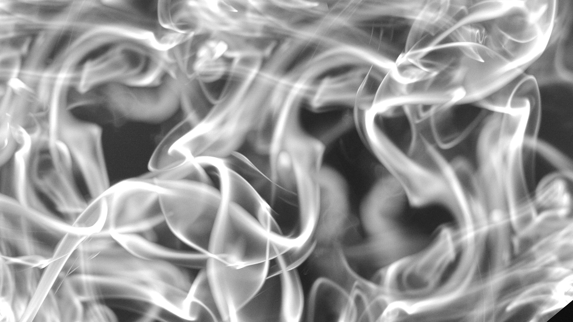
As a demonstration, lets start with this CC image from centophobia on flikr. With some quick rotating and additive blending (Lighten) in Photoshop, applying a greyscale mode change and then using the curves to give us contrast more suitable to our purposes we get an image like this (after resizing and cropping to fit a 1080p video).

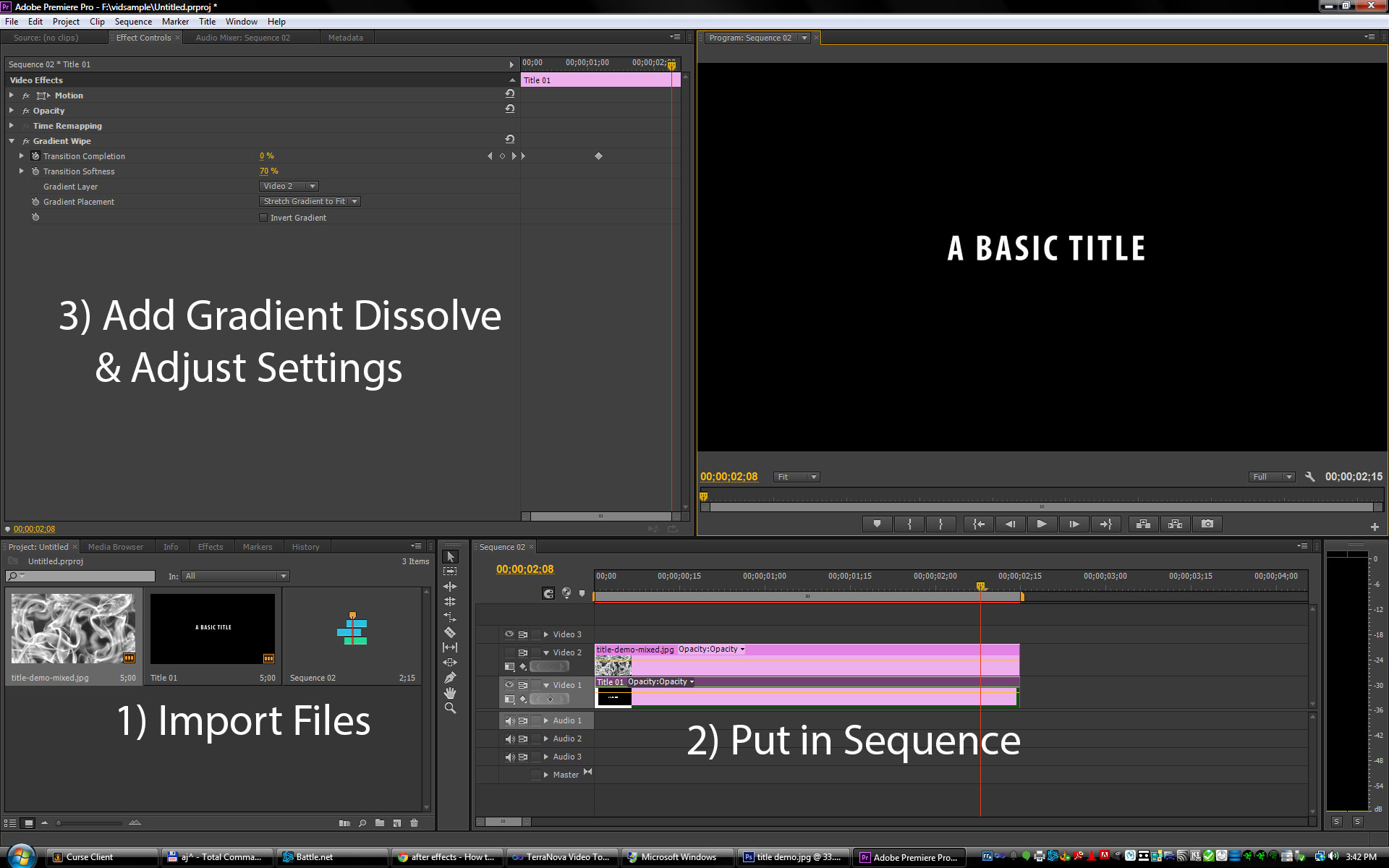
Now that we have an image to use for the base of our dissolve, we can actually do the title. Here is a screenshot from doing this in Premiere.

First, I imported the image I created and then I made a basic title with plain white block letters. I then added both of these to a sequence. Note that the smoke layer should be in the sequence with the title, but it should not be visible.
Next, I added a Gradient Dissolve to the title clip from the Transition Effects. Set the Gradient Layer to the layer you put your gradient map on (the smoke image.)
Next, adjust the settings to add softness to the transition (this is what causes it to work through the gradient rather than having a hard line being exposed).
Set a keyframe on the transition completion at the beginning and end of where you want it to dissolve in (using the little stopwatch looking button) and set a keyframe at 100 for the beginning and 0 for the end.
When you run it you should get something like this:
Now for the other titles, it does appear to clearly be working off the strokes of the characters, so there are a few different possibilities. The most likely one would be to use a similar gradient dissolve, but build the mask based directly on the title. Drawing a gradient on each character would allow for the control of the reveal to be precisely controlled and the Transition softness would be set to 0 or near 0 to keep a hard line.
As an example, here's doing something for a large letter K.

They may have had a titling software that could generate the gradients for them. Stroke animation is another option, but you'd have to use true vector shapes for the fonts then and a lot more manual work would have to be done to keyframe each different part of each stroke. The gradient way isn't particularly quick, but it's probably less effort than stokes.
The final transition appears to just be a highly motion blurred image flying across the frame really quickly and having the other clip after it clears the field. Just take an image with a lot of horizontal blur, send it across within a few frames and cut to the other video the moment it completely obscures the scene.
