Movies have certain "looks" to arouse certain moods. The lightning and color depends on the intention of the movie and each individual scene.
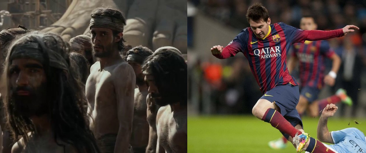
Let's take the picture you linked as an example:

The footballer is lit by the floodlights in the stadium. He is lit from every side so that you can see as much as possible, there is little shadow and contrast. The movie scene with the delightful workers is very different: There is a leading light coming from the left, with shadows on the right side. It may look like sunlight, but this was most likely achieved with a set of spotlights. At the very least, you usually use three different lights coming from different directions. This is called three-point lightning. From Wikipedia:
The key light, as the name suggests, shines directly upon the subject and serves as its principal illuminator; more than anything else, the strength, color and angle of the key determines the shot's overall lighting design. [...]
The fill light also shines on the subject, but from a side angle relative to the key and is often placed at a lower position than the key (about at the level of the subject's face). It balances the key by illuminating shaded surfaces, and lessening or eliminating chiaroscuro effects, such as the shadow cast by a person's nose upon the rest of the face. It is usually softer and less bright than the key light (up to half), and more to a flood. [...]
The back light (a.k.a. the rim, hair, or shoulder light) shines on the subject from behind, often (but not necessarily) to one side or the other. It gives the subject a rim of light, serving to separate the subject from the background and highlighting contours.
Of course, aside from the lightning, the garments, stage props and the likes are also picked carefully. Imagine how you would react to a shiny red plastic bag in Bilbo Baggins' Hobbit-Hole ...
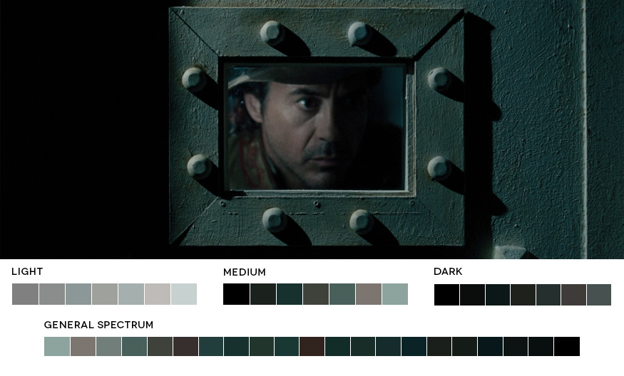
Then there is post-production, which has a huge role in creating a movie's look. Color-grading is the process of deciding upon a desired look for each scene and then adjusting the colors in this scene to have a coherent appearance. Take a look at movies in color, a great website that analyses movies and creates color palettes to show which colors are dominant in a movie. For example, this is the color palette of Sherlock Holmes: A Game of Shadows, which uses mostly blue-grey colors:

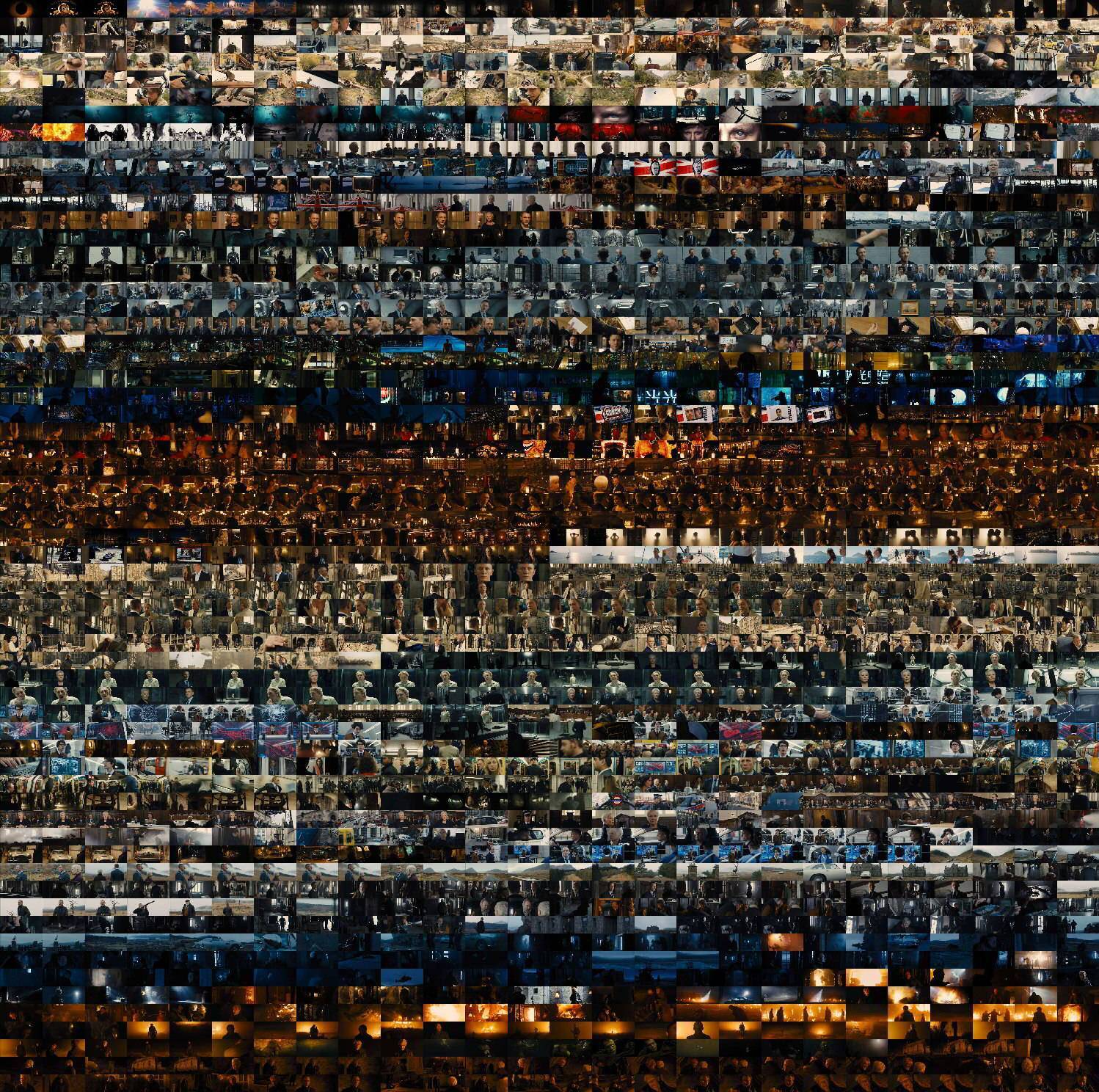
More palpable, this is a collection of ordered stills from James Bond: Quantum of Solace:

As you can see, each scene has a specific color range that is used to convey certain moods. The color-grading process is very difficult, there are people who do nothing but that for a living ...
Tl;dr: The speficic look of a movie is achieved through a combination of sophisticated lightning techniques, the choice of stage props and post-production efforts.
